Would you like to know how to generate a histogram in Python? In this tutorial, I will show you how to do it.
You can represent the distribution of numerical data with a histogram (Karl Pearson introduced this term). A histogram is a visual representation of data that uses bars of various heights where each bar divides numbers into ranges. Two modules you can use to plot a histogram in Python are Matplotlib and Pandas.
Knowing how to create histograms is a valuable skill in your data analysis toolkit.
Let’s find out how to create a histogram!
What is a Histogram?
Histograms constitute a critical tool for statistical analysis and data science, offering insights into the distribution of data sets.
A histogram is a way of displaying the distribution of a numerical set of data using bars of different heights. Each bar in a histogram represents data points within a specified range of values, known as a ‘bin’ or ‘bucket’. The height of a bar reflects the number of data points falling within that range.
For example, in a histogram of people’s age, each bar could represent the number of people in a certain age range. Taller bars indicate more data points in that range, providing a quick visualization of the distribution of your dataset.
Now let’s look at how you can plot a histogram in Python. We will start with the Matplotlib library that you can use to create graphs and charts.
How Can You Generate Data for a Histogram Using NumPy?
Let’s create some dummy data using NumPy. We will use this data to plot some histograms.
NumPy is a popular Python library for numerical computations. It can handle multi-dimensional arrays, among other mathematical functions.
To start using NumPy type the following pip command that will install the NumPy module.
pip install numpyNote: The best practice when setting up your Python environment and installing modules is to execute your applications in a Python virtual environment.
Similarly, you can install Matplotlib using the following pip command:
pip install matplotlibAfter importing NumPy, you can generate data by using NumPy arrays. The following code produces random samples from a normal Gaussian distribution.
import numpy as np

# Create dummy data points
data = np.random.normal(170, 10, 250)
print(data)
Let’s break down what this code does:
- NumPy Library:
npis a common abbreviation used for NumPy. - Function Used:
.random.normal(): This is a function from the NumPy library that generates random numbers based on the normal distribution, which is a common distribution in statistics often represented by a bell-shaped curve. - Parameters of
np.random.normal(): This function takes three key parameters:170: This is themean(μ) of the normal distribution. It’s the central point around which the random numbers will be distributed.10: This is thestandard deviation(σ) of the distribution. It describes how much the values will deviate, on average, from the mean. A larger standard deviation results in a wider spread of values.250: This is the amount of random numbers that the function will generate.
Here is the output of the np.random.normal() function. You have generated sample data using NumPy.
[178.6389057  160.71481129 176.06380975 170.26836416 168.64962801
 167.77093268 189.89642816 167.57947841 187.95156914 185.14287433
 173.77094473 181.96577219 171.40557555 168.42044648 181.90741839
 182.15559495 151.58511408 165.68497833 163.91143081 170.86070342
 165.91667438 177.44452444 161.35877875 170.74342034 161.41709815
 187.54503422 160.61351112 177.18043424 180.366389   177.56347178
 165.48898864 189.19288388 186.5750155  154.66924922 … 170.94541687]
Using the type() built-in function you can also check the type of data returned:
print(type(data))

[output]
<class 'numpy.ndarray'>
The output is a NumPy N-dimensional array.
Now it’s time to plot a histogram based on this data.
Plotting Histogram Using Python and Matplotlib
Using NumPy you have generated the data to plot. We will now use Matplotlib to plot out the first histogram.
The following snippet of code generates a basic histogram:
import matplotlib.pyplot as plt
import numpy as np

data = np.random.normal(170, 10, 250)
plt.hist(data)
plt.show()
The two lines plt.hist(data) and plt.show() plot and display a histogram of the data generated by NumPy. Let’s break down what each of these lines does:
plt.hist(data):pltis a common abbreviation formatplotlib.pyplot, which is a sub-module in Matplotlib used for plotting graphs and charts.hist()is a method in thematplotlib.pyplotsub-module. This function creates the histogram.datais the dataset we use to generate the histogram. In this case,datais the array of 250 random numbers you have generated previously using NumPy.- When
plt.hist(data)is called, it calculates the frequencies of the values indataand groups them into bins (ranges of values). The function then plots these frequencies as bars in a histogram.
plt.show():show()is a function in thematplotlib.pyplotsub-module. It opens up a window that displays the histogram.
You have successfully plotted a histogram. Here is the picture of the histogram:
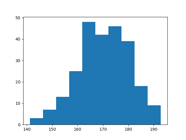
The X-axis displays the range of values present in the dataset data. Since data is generated using a normal distribution, the X-axis represents the intervals or ‘bins’ of this distribution. In this case, these bins are centered around the mean value 170, which was specified as the mean for the normal distribution.
The Y-axis shows how many data points from data are found in each bin.
How to Customise a Histogram Using Matplotlib
Matplotlib comes with a lot of parameters to customize the format of graphs and charts. We will use them to improve the histogram.
In the table below you can see some common parameters:
| Parameter | Description |
|---|---|
| bins | The bins parameter is used to specify the number of bins (intervals) you want to divide the distribution into. |
| color | The color parameter is used to colorize the histogram. |
| bottom | It allows modifying the location of the bottom of each bin in the histogram. |
| align | It defines the horizontal alignment of the bars of the histogram (‘left’, ‘mid’, ‘right’). |
The table above only includes some of the most common parameters. You can find all of them in the official documentation of the matplotlib.pyplot.hist() method.
Now let’s use some of the parameters above to see how the histogram changes.
import matplotlib.pyplot as plt
import numpy as np
data = np.random.normal(170, 10, 250)
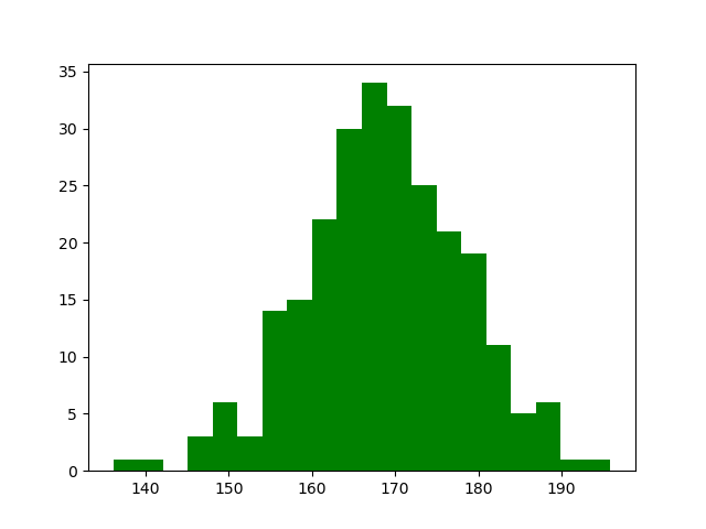
plt.hist(data, bins=20, color='green')
plt.show()The code above is the same with small changes. We have set bins to 20 and the color of the histogram to green.
Here is what the histogram looks like:
How To Draw a Histogram Using Pandas
To manipulate and analyze data, the Python programming language has a library called Pandas. It allows you to work with time series and mathematical tables.
With the help of Pandas, you can perform data analysis tasks easily and time efficiently.
The Pandas library provides the built-in function hist() that you can use to draw a histogram.
You will generate a histogram using the hist() function based on the sample data we have previously generated. Here is the Python code to do it:
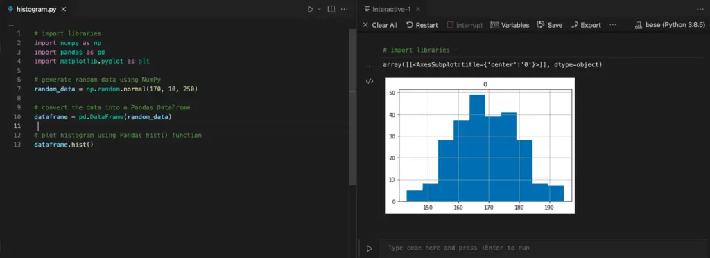
# import libraries
import numpy as np
import pandas as pd
import matplotlib.pyplot as plt
# generate random data using NumPy
random_data = np.random.normal(170, 10, 250)
# convert the data into a Pandas DataFrame
dataframe = pd.DataFrame(random_data)
# plot histogram using Pandas hist() function
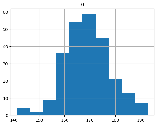
dataframe.hist()This code generates data the same way we did previously using NumPy and then creates a Pandas DataFrame from that data.
Then call the hist() function on the Pandas DataFrame which produces the following histogram.
To show the histogram in Visual Studio Code, right-click on the area where your code is and select “Run Current File in Interactive Window“.
You will see the following histogram:
As an alternative to Visual Studio Code, you can use Jupyter Notebook.
Conclusion
In this tutorial, we have first covered the basics of histograms and understood their purpose.
You then implemented Python code to plot histograms based on dummy data generated using NumPy. And you have seen how to apply different parameters when generating histograms.
At the end of the article, we have drawn a histogram based on the same dummy data using the Pandas library.
Bonus read: Practice using Pandas. Learn how to calculate the standard deviation of a data set using Pandas.

Claudio Sabato is an IT expert with over 15 years of professional experience in Python programming, Linux Systems Administration, Bash programming, and IT Systems Design. He is a professional certified by the Linux Professional Institute.
With a Master’s degree in Computer Science, he has a strong foundation in Software Engineering and a passion for helping others become Software Engineers.